


What would you say is the primary organ used for your sense of sight? Because while your eyes do collect visual information, your brain is the mastermind behind it that interprets the data in a way that is meaningful to you. You can manipulate the brain to your advantage in your designs by merely adjusting the hue, value, and saturation of different colors. Color Theory Basics As you get started with your next design, revisiting some basics of color theory can be helpful. Did you know that the human eye adjusts when focusing on colors of different wavelengths? This is why colors with longer wavelengths appear closer while those with shorter wavelengths seem more distant. Cool colors (blue, green, purple) seem to recede, while warm colors (red, yellow, and orange) seem to close in or advance. In multicolor compositions, contrasting colors can create all kinds of movement.
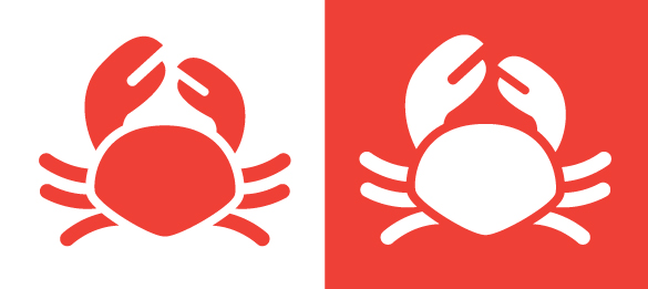
Here are some other brain-manipulating techniques you can experiment with on your next print project. 1. Create More Contrast
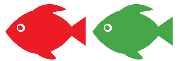
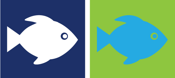
2. Experiment with Different Hues
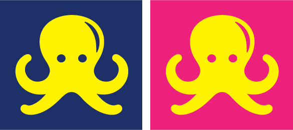
3. Use Dull, Neutral Backgrounds
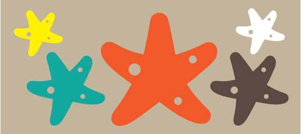
4. Influence the Way Viewers Perceive Size
Here’s a more real-world example: a political advertisement contrasting two people may use a photo of the opposing candidate wearing a blue shirt positioned in front of a cool green background. Next to this photo, the favored candidate wears a gleaming white shirt while placed before a dark blue background. Though the portraits are equal in size, the white to blue contrast exerts a visual force on the eye that makes the favored candidate seem larger. This gives “the good guy” a substantial, energetic persona that dominates the page! Every element in your design exerts a visual force that attracts a viewer’s eye. Use color contrasts to make your products advance, to increase the weight of your focal point, and to stir an emotional response in your audience. |